Category Archives: Uncategorized

A long review of Phil Town’s 2006 Rule One Investing

Who’s the author and do we care?

Phil Town is the author of two books, 2006’s Rule #1 and Payback Time

Town’s origin story is that casting about after serving in Vietnam as part of the Green Berets, he worked as a river guide in the Grand Canyon, where an older investor he met offered to teach him the ways of the stock market.[1] He then claims to have turned $1,000 into $1,450,000 in five years and became a full-time investor[2].

Now, he’s got a popular podcast where he’s teaching his daughter Danielle Town (who is so great as a foil and voice of the listener), and wants you to attend his seminars and subscribe to his stock research tools from him.

Should I read this or not?

Totally worth reading if you don’t already have a valuation strategy or process you’re into, with the caveat that theres’s some confusing additional material that might make you scratch your head.

If you do, or you’re more generally familiar with value investing (why it can work, particularly), there may not be a lot here.

The meat of the book: how to find good businesses on sale

Distilled, Rule One tells us to invest in good stocks that are 50% off. He’s got the “Four Ms” for you

  • Meaning
  • Moat
  • Management
  • Margin of Safety

And then walks you through each one. Some are easy to understand: for “Moat” he talks about competitive advantages you can count on over time. For “Management” you’re looking for some key metrics, and there are good explanations of why you want to look at each one.

“Meaning” isn’t quite the right term (and to his credit, on his podcast Town’s joked about how the neccessities of book marketing forced the names so there would be a catchy “Four Ms”) — but here, do you understand what the business is doing, and would you buy the whole business?

Where the real meat is for people will be in how you value and price stocks, looking for the discount. And here’s where a lot of math comes in, and I respect that: this isn’t Greenblatt’s “Magic Formula” where you just rank all the stocks. For every stock, Town walks through how to estimate the future value of the stock, and compare it to alternatives, like investing in U.S. Treasury bills, or against expectations.

I dug this a lot, but I also had to break out the spreadsheets, and it’s way more of a pain to get all the data together (this as much a problem with the web in 2017 though). Handy solution though — you can just subscribe to his website and get all those numbers in one place.

You end up with what Town calls the “sticker price” for a stock, the current fair value for a company given expectations for its growth. The explanation for the concept is excellent — that price should be a starting point, and you want a sale.

Running those numbers was an eye-opener for me and taught me a lot about how to think about stocks as both being a company’s value in the present but an expectation of future growth as well. For instance, I’d been griping that one company seemed wildly under-valued based on their price/earnings ratio. When I ran through the process here, I understood that it was priced perfectly reasonably.

Once you can calculate the sticker price, you want stocks that are at least 50% off. For this to be true, either the company is deeply out of fashion or something has gone horribly wrong and the stock’s being beaten up over bad news. As I write this, the CAPE (Cyclically Adjusted PE Ratio) is at 30.62, which is historically very high, and you’re not going to find many stocks on sale for half off.

Going off the rails: add technical analysis

Chapter 12 is “The Three Tools” and here Town talks about “red light” and “green light” indicators for whether to buy a stock. Here we diverge entirely from the value of a stock and get into some entirely different territory, and where I think the book loses people. Buying quality businesses on sale is simple, and while it takes a little work, it makes sense as you’re doing it.

In Chapter 12, suddenly we’re not just looking at business, we’re now trying to figure out what everyone else is doing, and things get way harder to understand.

The three tools:

  1. Moving average convergence divergence. As a measure of whether there’s “pressure” pushing the stock up or down
  2. Stochastics. Measures if something is “overbought” or “oversold” — and the explanation of this one is not great
  3. Moving average.

I’m going to say up front I didn’t get this chapter at all. I feel like I’m missing the point, so this will be a bit more uncertain.

This chapter confuses the issue by . For instance, you’re supposed to look at Stochastics for crossings of the 14-day and 5-day lines. For one, most places you look you don’t get a ‘buy’ and a ‘sell’ line as the book describes them, you get a “%k” and “%d” and it’s confusing. When I got through the instructions for setting one up using Town’s settings for time frames, I looked up some stocks, and it was a coin flip on whether the stock went in any discernable direction.

I don’t know if I was just unlucky or if I’m even using the tools right. My point is that if you’ve gone through the book and you’re working with pretty clear, understandable numbers (earnings per share is pretty much earnings per share), this shift to difficult to understand technical indicators is confusing and exaperating.

Moreover, there’s no convincing why here. The explanation of what we’re doing in this chapter doesn’t make it clear why it’s important to pay attention to it. It seems like the fact that you’ve found a company that’s on sale for 50% off should far outweigh whether others are getting into or out of the stock at the moment.

I was left thinking there are important signals I shoud pay attention to in addition to basic valuation, but unsure how I’d do that.

This is also where the book falls down on the cover promise of “successful investing in only 15 minutes a week!” Even if you’re only monitoring the few stocks you’ve bought, using these three tools once a day to see if you should bail on a stock, you’ve burned your 15 minutes squinting at whether one line crossed another.

It all feels like Town, as a long-time experienced investor familiar with tools like these, was unable to explain these or their importance in a way that made sense to those without the same experience, which is unfortunate because I got a lot out of the valuation sections.

And from there, much good is undone

Chapter 13 then walks through a possible example as a couple considers buying The Cheesecake Factory, Inc. The valuation all makes sense, and they buy. A chart of spectacular returns is shown — CAKE goes from $18.90 to ~$36 in two years, an 90% gain. Nice. The couple’s example $20,000 is now $38,000. Except… here’s what Town writes:

By getting in just below $19, and then moving in out 11 times in two years with the big guys, and by adding $500 a month they were saving, by July 2005, CAKE gives Doug and Susan a nice compounded rate of return of 56% and their $20,000 is now worth $78,000

He’s claiming twice that return rate.

Nope. Nope nope nope nope. Just… not true. At all.

1) Is the regular additional contribution counted as part of the return? It’s unclear. But why mention it otherwise? You can’t have them put more cash in and count that as what it’s worth now. I could have an $100 investment that’s totally flat and add $1m and wow, I beat the stock market over two years because now I have $124. This is, at best, confusing. At worst, he’s counting over $10,000 and associated gains in value as part of the return that shouldn’t be there.
2) They moved in and out 11 times? How do we know that? Does this assume that they perfectly timed each of those? When were those 11 moves? What did the technical indicators say at the time?
3) They’re going to get creamed on short-term taxes. The investor who held for more than a year pays way less.

Investor A: bought at the same time and held. +$18,000, may be paying zero in taxes
Investor B: bought, as a beginner times moving in and out 11 times, up $58,000, might be $40,000 after taxes.

If you think Town is counting the additional contributions in taxes, we’re down to around $30,000 for Investor B.

It’s not okay that this important calculation is so unclear, and the handling of the additional contributions makes me extremely suspicious. It doesn’t make sense as written, and I don’t understand what the point is. 89% over two years is great! Why confuse things?

This raises a larger question: does this all work? We’re presented with a couple examples of Company A compared to Company B, walked through the Cheesecake Factory example, but beyond those hand-picked examples, all we have to rely on is Town’s accounting of his track record. I’d have felt much better about the whole thing given a wider accounting of his trades, or of studies done on historical data — like we have for Greeblatt’s Magic Formula book.

Put it all together, what’s it mean

I dug reading it, and particularly found it useful in making me do real work putting things together and looking at companies. But I also found the technical tools section confusing and hard to understand, and the example math particularly worrying. It occupies a weird place in an investment bookshelf: I can see recommending it to someone who is interested in Warren Buffet’s investment philosophy and wants to know how to crunch the numbers to find those great companies at attractive prices.

[1] The story, as told, is so perfectly mythic that it’ll probably raise at least one eyebrow if you read it. But whatever.

[2] (I spent a little time looking at this, but besides him raising money in 2013 for Rule One Capital, I couldn’t find anything on early investment proof or his returns as a manager).

[3] Similarly, Town claims early that as a Vietnam veteran, on his last day in uniform he was at the Sea-Tac International airport when someone spat on him and ran away. This… I don’t know. That spitting at veterans happened at all is disputed: there’s a whole book on this, Spitting Image by Lembcke, discussing how no incident like this has ever been documented as part of a larger case that antiwar activists and veterans were allied far more than is now generally believed.

I thought about looking into this in greater detail (particularly, why would he be at Seatac on his last day in uniform, when it seems like he’d have flown into McChord Air Force base?), and stopped. This has been hashed out many other places, and it doesn’t seem relevant. Let’s just grant Town this.

Solving Drobo random unmounting issues

(Writing this up for hopeful discovery of future Drobo owners)

My Drobo started acting up a while ago in an incredibly frustrating way:

  1. The Drobo would sometimes not show up, or not mount, requiring a dance of restarting it, restarting the computer, plugging, unplugging
  2. When it was mounted, you’d get a short while before the Drobo went unresponsive in the middle of an operation, and then it’d unmount (and OS X would throw a warning about dismounting drives improperly)
  3. Sometimes if you left it connected for long enough, it would show up again, hang around for a bit, and then disconnect.

Nothing worked: re-installing software, resets, the “remove drives, reboot the Drobo, wait, turn it off, put the drives back in…” And all the while status-light-wise, and Drobo Dashboard-wise, it reported everything was good

And unhappily, Drobo support costs money, and I’m cheap, so I wasted a ton of time troubleshooting it. As a bonus, their error logging and messaging is either unhelpful or encrypted.

(I feel like if you encrypt your device’s logs, you should offer free support at least for unencrypting the logs and letting the user know what’s up. I’m disappointed in them and will not be purchasing future Drobos. Or recommending them.)

Eventually I pulled each of the drives and checked their SMART status (OK status overall on all drives, though I also pulled the details and one of them had flags, but SMART’s not great (see: Backblaze’s blogs on this). So I cloned them sector-by-sector onto identically-sized drives. The drive with the odd SMART errors (but, again, overall OK status) made some really unsettling noises at a couple points during sustained reads, but the copy went off okay.

Fired it up, and it worked. Drobo came back on, mounted, works fine (for nowwwww….).

I spent some more time hunting around in the Drobo support forums looking for more information, and found someone reporting back on a similar issue said they’d had a drive go bad but the Drobo never reported any issues, and it wasn’t identified until support looked through the encrypted error logs and said “oh, drive number X is going bad, that’s causing your Drobo’s strange behavior.” Clearly, given my success, at least one of my drives was secretly bad and cloning and replacing was the solution

So! May writing this up help at least one future support-stranded Drobo owner: if your Drobo is unmounting randomly, not showing up in the Finder, throwing dismount errors, but the Drobo’s reporting that everything is hunky-dory, and you don’t want to pay for support and you’re willing to take advice from some random fellow owner on the Internet who may not even have the same issue… here’s one approach before you throw your malfunctioning Drobo out the window:

  1. Power it down and pull the drives
  2. Using whatever utility you like, check the high-level SMART status on the drives to see if something’s clearly screwed up
  3. (optional, if they’re all okay) look at the detailed SMART errors and see if any of the drives looks really wonky
  4. If any of them are bad, do a sector-by-sector clone of that drive, swap the clone in, power up the Drobo, see if that works. If yes: yay! If not —
  5. Clone & replace them all, see if that works.

May this work, and may the drive be in good enough shape to successfully clone.

I should also note that as much as I’m annoyed my Drobo was out of support, assuming they would have been able to tell me what was happening and which drive to clone and replace, it would have been worth it to pay for the per-incident to save myself the headache.

Your data are racist

Say you’re a university loan administrator. You have one loan and two students, who anonymized seem to you in every way identical: same GPA, same payment history, all that good stuff. You can’t decide. You ask a data-driven startup to determine which one’s the greater risk to default or pay late. You have no idea how they do it, but it comes back —

The answer’s clear: Student A!

Congratulations, you’ve just perpetuated historical racism.

You didn’t know it. The startup didn’t know it: evaluated both students and found Student A’s social networks are stable, and their secondary characteristics are all strongly correlated with future prosperity and loan repayment. Student B scores less well on social network and their high school, home zip code, interests, and demographic data are associated with significantly higher rates of late payments and loan defaults.
From their perspective, they’re telling you — accurately, most likely — which of those two is the better loan risk.

No one at the startup may even know what the factors were. They may have grabbed all the financial data they could get from different sources, tied it to all the demographic data they could find, and set machine learning on the problem, creating a black box that they show is significantly better than a loan officer or risk analyst at guessing who’s going to default. No one

Machine learning goes like this: you feed the machine a sample of, say, 10,000 records, like

Record Foo

  • Zip Code: 98112
  • Married: Yes
  • Age: 24
  • Likes Corgis: Yes
  • Defaulted on a student loan: No
  • Made at least one payment more than 90 days late: No

Record Bar

  • Zip Code: 91121
  • Married: No
  • Age: 34
  • Likes Corgis: No
  • Defaulted on a student loan: Yes
  • Made at least one payment more than 90 days late: Yes

You set the tools on it and it’ll find characteristics and combinations of characteristics that it associates with the outcomes, so that if you hand it a new record: Angela, a 22-year old from Boston, unmarried, doesn’t like Corgis, and your black box says “I’m 95% sure they’ll default.”

It’s the ultimate in finding correlation and assuming causation.

You see how good it is by giving it sets of people where you know the outcome and see what the box predicts.

You don’t even want to know what the characteristics are, because you might dismiss something that turns out to be important (“People who buy riding lawnmowers buy black drip coffee at premium shops? What?”).

Because machine learning is trained up on the past, it means that it’s looking at what people did while being discriminated against, operating at a disadvantage, and so on.

For instance, say you take ZIP Codes as an input to your model. Makes sense, right? That’s a perfectly valid piece of data. It’s a great predictor of future prosperity and wealth. And you can see that people in certain areas are fired more from their jobs, and have a much harder time finding new ones, and so default on payments more often. Is it okay using that as a factor?

Because America spent so long segregating housing, and because those effects continue forward, using ZIP means that given ZIP X I’m 80% certain you’re white. Or 90% if you’re in 98110.

We don’t even have to know, as someone using the model, that someone is black. I just see that people in that zip code predict defaults, or being good on your loan. Or I might not even know that my trained black box loves ZIP Codes.

And if you can use address information to break it down to census tract and census block, you’re even better at making predictions that are about race.

This is true of so many other characteristics. Can I mine your social network and connect you directly to someone who’s been to jail? That’s probably predictive of credit suitability. Oh — black people are ~9 times more likely to be incarcerated.

Are your parents still married? Were they ever married? That’s — oh.

Oh no! You’ve been transported back in time. You’re in London. It’s 1066. William, Duke of Normandy, has just now been crowned. You have a sackful of gold you can loan out. Pretty much everyone wants it, at wildly varying interest rates. Where do you place your bets?

William, right? As a savvy person, you’re vaguely aware that England has a lot of troubles ahead, but generally speaking, you’re betting on those who hold wealth and power to continue to do so.

Good call!

What about say, 500 years later? Same place, 1566. Late-ish Tudor period. You’re putting your money on the Tudors, while probably being really careful to not actually reminding them that they’re Tudors.

Good call!

Betting on the established power structure is always a safe bet. But this means you’re also perpetuating that unjust power structure.

Two people want to start a business. They’re equally skilled. One gets a loan at 10% interest, the other at 3%. Which is more likely to succeed?

Now is the bank even to blame for making that reasonable business decision? After all, some people are worse credit risks that others. Is the bank to disregard a higher profit margin by being realistic about the higher barriers that minorities and women face? Don’t they have a responsibility to their shareholders to look at all the factors?

That’s seductively reasonable. Too see this at scale, look at America’s shameful history of housing discrimination. Blacks were systematically locked out of mortgages and house financing, made to pay extremely high rates without building mortgages, never building equity. At the same time, their white counterparts could buy houses, pay them off, and pass that wealth to their kids. Repeat over generations. Today, about a third of the wealth cap in families, where white families have over $100,000 in assets and minorities almost nothing, comes from the difference in home ownership.

When we evaluate risk based on factors that give us race, or class, we handicap those who have been handicapped generation after generation. We take the crimes of the past and ensure they are enforced forever.

There are things we must do.

First, know that your data will reflect the results of the discriminatory, prejudiced world that produced them. As much as possible, remove or adjust factors that reflect a history of discrimination. Don’t train on prejudice.

Second, know that you must test the application of the model: if you apply your model, are you effectively discriminating against minorities and women? If so, discard the model.

Third, recognize that a neutral, prejudice-free model might seem to test worse against past data than it will in the future, as you do things like make capital cheaper to those who have suffered in the past. Be willing to try and bet on a rosier future.

Citations on wealth disparity:

http://www.demos.org/blog/9/23/14/white-high-school-dropouts-have-more-wealth-black-and-hispanic-college-graduates

http://www.demos.org/publication/racial-wealth-gap-why-policy-matters

I ran a Problem Roadmap meeting and it was pretty great

I’ve taken on Product Management for a set of internal tools, and found myself lost in 700-some open tickets (including meta-tickets and sub-tickets and all that goodness). Product’s a relatively new discipline at the company, the tools team is saddled with technical debt and severely resource-constrained, and my early discussions with internal customers ran strong with discontent.

As a fan of Mellisa Perri generally and “Rethinking the Product Roadmap” in particular, I wanted to try seeing if a Problem Roadmap meeting would help.

I hoped a problem roadmap would give us all agreed-on, prioritized problems we could evangelize and pursue, going from being ticket-or-project focused (700 tickets!) to outcome-focused, and start reducing the iteration time from months to weeks and soon, days. Then I’d be able to start culling that backlog like crazy and lining up ideas and bugs against outcomes we were pursuing, and we’d all have clear success metrics we could look to.

I invited members of the development team and a cross-section of interested people in the support organization for two hours. We ended up with ~12 people.

To start, I presented the goals for the company that related to the discussion: where did we need to get to with customer satisfaction overall, and our goals specific to our customer support organization.

I introduced what we were trying to do in the meeting, along with an example problem and a metric that could trace it. On the giant whiteboards, I drew two columns for problem and metric to measure it.

Then I asked “What are the problems we’re facing getting to our goals?”

Early, our conversations were specific: “Bug X is hurting us” which in turn led to “Oh, we’re working on that” (which I was guilty of). We’d come up with metrics to measure those and move on. As we filled each whiteboard up, I’d move to the next board (or take pictures and erase all three)

We quickly moved to larger issues, and the discussions got into new, interesting problems I knew we weren’t already discussing. Which led to eager participants jumping to “how we could fix that.” This was challenging: when do you bring that back, and when do you let it run?

I’d explain (or re-iterate) once we’d defined problems and metrics, we’d vote and then pursue solutions. But some of the ideas were so good, it was hard to rein them in.

With more problems, we got better defining the metrics we’d use, and it led to a focus I hadn’t seen in other meetings trying to address this. In some cases, needing metrics meant reconsidering what we thought the problem meant, sometimes discovering there was more than one problem.

New, more specific descriptions often illuminated issues there’d long been angst but not clarity around, and the metrics provided a way for us to target them. For example, a problem that a tool didn’t work right resulted in us defining three issues: workflows, tool design, and then the technology, all with metrics. That clarity would have made this worth doing on its own.

Requiring metrics forced uncomfortable discoveries that we didn’t have useful measurement against our goals, which I’d also have held the meeting just to find out.

Towards the end, we’d gotten to amazing discussions I hadn’t yet seen. New problems just under the company and organizational goals, and in considering those, a problem around whether the organization was structured to pursue our larger goals.

I’ll offer two examples of the kind of problems we came up with early, and then later as conversation opened up

Problem Metric
Portland coffee is 10% worse than Seattle’s Survey of employee satisfaction; dev team velocity; chats answered/hour
We can’t see if we’ve met our goals if we can’t measure them Yes/no: are there metrics in place that measure x/y/z?

Yup. 90 minutes from Bug A (Bug A, measure Error A) to sweeping, actionable metrics (Organizational issue B, employee satisfaction, workflow measurement, other good stuff).

Then the voting. I re-wrote the list from the photos for space, and then gave everyone five votes, multi-votes okay. Here’s what happened:

Problem Votes
Huge existential thing we’d never talked about 9
Large systemic issue with banky thing A 5
Large systemic issue with bank thing B 4

… followed by a long tail of 2s and 1s.

We’d never talked about the top item before! Anywhere! It wasn’t on a roadmap! It wasn’t in any of the 700 tickets! Brand new! I’m using exclamation points!

Both the problems and metrics we came up with around the 2nd-and-3rd place priorities clarified huge problem clouds (dozens of tickets filed against something with different solutions or issues, all without metrics or an overall goal).

That’s gold. I’m so happy.

I’d recommend this approach to anyone doing Product (or Program) Management looking for a way to re-focus conversation on outcomes. I’ll report back on how evangelizing the findings goes. The discussions it inspires around the problems, and how to measure them, made it worthwhile.

I can see where it might be less valuable if you’re tightly bound to prescribed work… but also, I can see where it might help you break out from that.


Now, some random miscellany.

Logistical challenges running the meeting:

  • It was hard for me as person-at-the-whiteboard to keep up with discussions as they picked up pace, and especially when
  • Problem A would come up, inspiring someone to shout Problem B, sparking discussion, and Problem A would languish
  • The layout of the conference room. I wrote on the wall-of-whiteboards and everyone else faced me from the other side. I’d like to find a better way to do that, but all conference rooms are going to have some version of this problem

Questions I’m considering for next time:

  • Do I do this again with different people from the same teams? When?
  • How to better communicate what the next steps will be, and does that improve focus?
  • Is there a better way to introduce the concept of the meeting?
  • Would a note-taker help?
  • How would a meeting like this incorporate remote employees?
  • What’s the best way to manage voting on a list like that? Are the differences between voting methods even meaningful?

Simpler Days, #2

“I love talking to new users, they’re so full of wonder.” — Simple person

After two days at Simple, some random thoughts:

They’re unbelievably dedicated to customer service. Part of why I signed on was that I knew this, but I keep finding it’s greater than I thought.

Their customer service people, who are here, in Portland, have no scripts.

No scripts.

They’re free to listen to and help people however they can.

This is so great.

Then, when a co-worker was walking me through some parts of the application, he’d show me something and then some tiny edge case where it was so clear that someone had sweated the details. I said “that is so cool” repeatedly as he demonstrated things.

They’ve managed this under nearly unbelievable constraints, being in the banking industry. And I spent five years at the start of my tech career in telecom. That the product is as surpassingly good as it is is amazing.

I filed my first two bugs against the site today, which should surprise no one who knows me. My first bug was yesterday, against an internal tool.

Mind-mapping software for Mac OS X mini-reviews

(Written because all the Google Search results I could find were spam)

Desktop only, b/c I’m specifically looking at things you can use while not internet-connected.

How I evaluated: I mapped out my thinking on some simple project ideas, which meant a lot of entering new text, and then I tried taking notes on a presentation, which added more navigation and on-the-fly reorganization.

Mind-mapping tools I’d recommend

MindNode Pro

$20, free trial available

Pretty sweet, easy to use, pretty, simple look to it, surprising depth once you start to poke around in what you can attach and do with stuff. I dig it. The free trial is

The companion iOS apps look pretty good too, though I’m satisfied with iThoughts there.

I also don’t get why it’s MindNode Pro: wasn’t putting “Pro” on your app a thing you did when there were free and paid versions, like that phase where we named the paid versions “HD?”

Xmind

Free, Pro version available

I liked this a lot, seemed to drain battery like crazy. The Plus and Pro versions are targeted towards businesses (Gantt View, only $99 more for a limited time), with the only thing you might need being some of the export tools. But you’re probably fine.

Mind-mapping tools I wouldn’t recommend

Scapple

$15, free trial available

I love Scrivener, and I love how Literature & Latte runs their shop — my experiences with them over the years have been uniformly good.

Big difference between this and others is that Scapple defaults to a map without hierarchy: you’re not starting with a central topic and building out. Everything’s an island and then you like them up, toss a picture in, whatever. For that, it’s great, and the ease of use is good.

My problem is that for the stuff I most frequently use mind mapping for, I just could not seem to make it work fast enough: where I’m cruising along hitting tab/enter and typing as I go, Scapple never allowed me to get into that flow. I really wanted to like it more, and might return to it for doing writing brainstorming.

Mind Manager $350. Plus subscription stuff.

Targeted for the enterprise that can buy and negotiate licensing fees, I guess. I’ve played around with the free version, it seemed great and over-featured for personal use. But I don’t need another project management collaboration tool set, and I don’t have $350.

Freemind/Freeplane

Free. Built in Java. It looks like dated open-source software for Windows 3.11, but seems to work okay. Requires Java. Java kills batteries dead.

Bringing a tank to a water balloon fight: huge apps that can mind map

You can of course take any sufficiently advanced graphing program and use it, or a plug-in, or whatever. My experience is that they’re too heavy, and actually way harder to use than XMind or MindNode.

Of them, OmniGraffle seemed the least-horrible option for mind-mapping, and is also a pretty great diagramming application in general. It is, however, $99 for the standard version and $199 for the business-y version with Visio support and fancier export options. On the plus side, OmniGroup are a great bunch of people, with amazing customer support.

Towards better agile status reports

“It is important to communicate to stakeholders that early calculations using velocity will be particularly suspect. For example, after a team has established some historical, data, it will be useful to say things like, “This team has an average velocity of 20, with a likely range of 15 to 25.” These numbers can then be compared to a total estimate of project size to arrive at a likely duration range for a project. A project comprising a total of 150 story points, for example, may be thought of as taking from 6 to 10 sprints if velocity historically rangers from 15 to 25.”

— Mike Cohn, Succeeding with Agile 2010.

This requires that you have the project’s scope and cost in story points clear at that point, which you won’t have. Story point estimation takes time to achieve any useful consistency, and especially to do the kind of learning (“last time we took something like this on, it was an 8, not a 3”) that gets you to numbers you might want to rely on.

It depends on scope being set — and how often is that true, particularly on agile projects where you’re able to show users the product at the end of each sprint and make adjustments?

More importantly, say these teams are relying on the release date of a project:

  • customer support, which needs to update all the help documentation and set up training with the people who pay you money
  • marketing, which needs to create materials based on final screenshots and capabilities
  • other teams, which will use the delivered work to create new projects

Where if you deliver early, that’s great, they have more time to rehearse, edit, and control over whether they want to release early.

If you’re late, they need to know as soon as possible if they need to start cutting schedule or scope, or spend more to keep those constant and meet a new deadline.

Then take Cohn’s example. If my company is lining everything up behind a date, and my status email is

“We have 150 story points remaining, and the team’s current velocity is 20 per two-week sprint, with a range of 15-25, so we should deliver between 20 weeks from now and 12 weeks, and probably around 16 weeks, which is on time.”

People would rightly stand up from their desks and hurl the nearest team-building trophy at me.

At the same time, putting more information about the probabilities and how you calculated them isn’t going to help. You can’t talk about the power law or the Hurst Exponent here. The question people want answered is: do I need to take action?

You’re going to end up reconciling this to some organizational standard, like:

  • Green: On target
  • Yellow: Risks but on target
  • Red: Will miss date unless changes are made

Which actually means for PMs:

  • Green: I’m not paying attention
  • Yellow: I’m on top of things
  • Red: Please have your VP come by my desk immediately and yell at me

And for your customers, eventually means:

  • Green: the PM isn’t paying attention so I won’t either
  • Yellow: something meh whatever
  • Red: aieeeeeeeeeeee

Then what do you say in your one-sentence “summary” at the top of your status report, the one thing people will read if they open it at all?

My best results came from straight team votes at the end of the sprint: ask “Do you feel confident we’ll hit our date?”

80% or more thumbs up? Green.

50%? Yellow.

Under 50%? Red.

This requires the team trusts they can give their honest opinion and not be pressured. If that’s not the case, do the rest of the PM world a favor and leave our ranks.

Ask, get the number, and nod. Don’t argue, don’t cheer, just nod, and use that. Then in your status report, you write

“We’re green.” If you want, offer “(87% of team members believe we will meet our target date)”

Now, you do want to express the uncertainty, but in a way that people can use. Think of yourself as a weather forecaster. Do you tell people to bring umbrellas? Put on sunscreen?

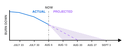
Hurricane forecasting has a useful graphic for this:

Hurricane forecast example

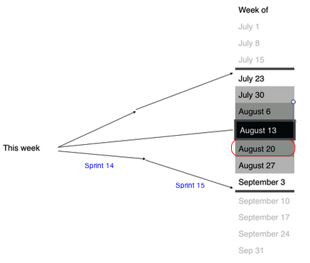
Where on the calendar does your project land, and with what certainty? Assume that you ship every week on Friday. Why not

Status forecasting

Distance from the calendar is how far out you are, and the shading indicates likeliness. Mark the release deadline with red (or a target, or…).

Daniel Worthington offered this:

Screen Shot 2014-08-18 at 11.57.58 AM

Which is even better.

So two questions for you — 1) How do you effectively measure uncertainty on a project’s delivery date? 2) How do you convey that so it’s simple and easy to act on?

The Side: Everything fails

In which I whine about tools.

I’m sure for developers who work with Ruby the maze of tools, installs, and dependencies is like swimming in water to a fish. Except just from work, the fishes complain a lot about it too. For me, though, it’s so fucked up I want to throw something at it.

Let’s say I want to install Ruby and Rails on my Mac.

% brew install ruby
(vwhoosh! works)
% gem install rails
(bombs on crazy UnknownHost error)
% gem install rails
(vwhoosh! installs a ton of stuff)
% rails –version
Rails is not currently installed on this system. To get the latest version, simply type:

$ sudo gem install rails

You can then rerun your “rails” command.

(cursing)

Okay, so let’s figure out how to do that. Stack Overflow answer says this is a command line tools issue. Do I have the command line tools? I’ll check — Crap, it returns a “Can’t install software because it is not currently available in the Software Update server” error. That makes no goddamn sense.

Back to Stack Overflow… ah! That’s a bug. I guess I’m actually fine. BLARGH.

Except rails will install and then tells me it didn’t. Still haven’t figured that one out.

And hey — as in Python, there’s a huge set of version differences!

Q: Hey, I’m a normal dude trying to get this thing up, which version of Ruby do I —
A: (shrug)
Q: Thanks for that.

To deal with all these dependencies, I can use rvm which… I don’t even know! Woo!

This seriously makes me want to go back to wrestling with Python. Or set fire to my computer.

Review skimming escalation

Dungeon Keeper’s catching flak for its terribleness, and today’s story is their new implementation of review skimming.

Check out their writeup.

Here’s their picture of where this goes beyond anything I’d seen before:

Where, say, OkCupid asks “love us?” and “leave feedback” to try and skim off only the people who’ll leave good reviews, Dungeon Keeper’s explicitly asking you what your star rating would be, as if you’re rating it right then (in a window labelled “Rate Your Experience”)(!).

Logical next step would be to present a fake Android rating screen that discards 1-4 star reviews and then submits 5-star reviews on the user’s behalf.