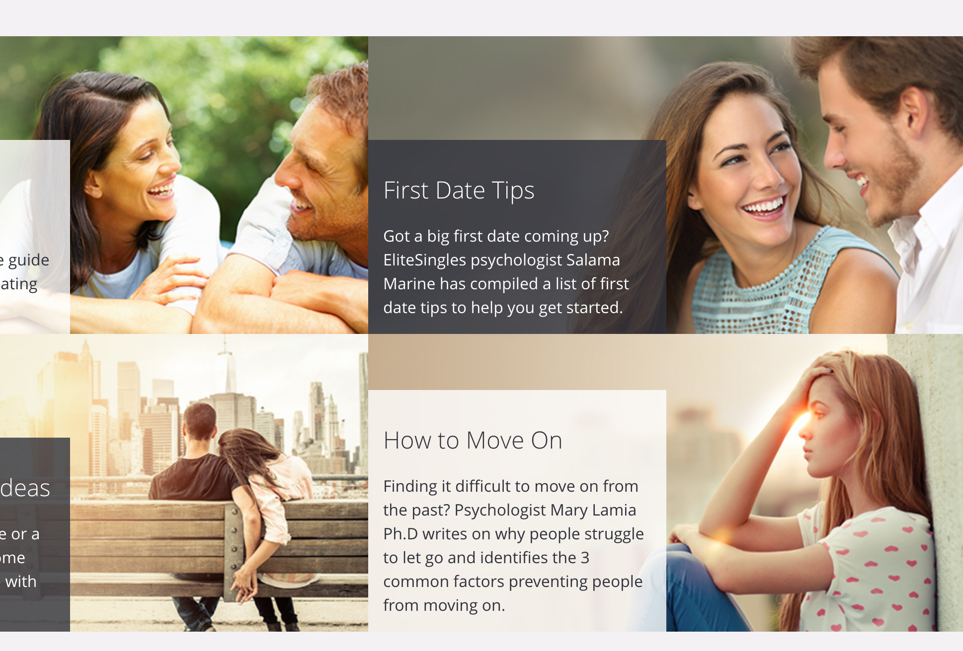
Fresh off our Match adventure, let’s check out EliteSingles. First, scan the page, who do we think their target market is?

Â

Huhhhhh.
Even the stock image of the customer support person — I’m presuming, yes —Â

ðŸ˜ðŸ˜‘
Moving on. They make some bold claims:

High success rate? Compared to what? What’s the rate? Weird they won’t tell me.
Â
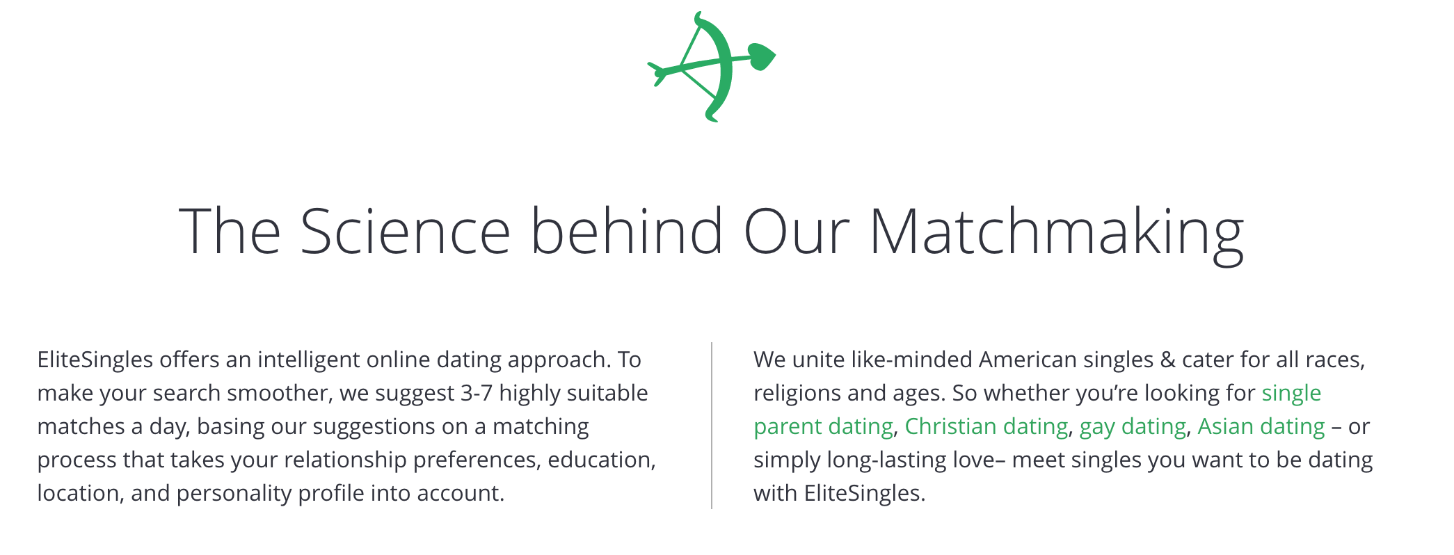
It’s a little odd they claim elsewhere that EliteSingles is all about serious dating, then here it lists out some dating phrases (for SEO, presumably) followed by “or find love, idk 🤷â€â™€ï¸ ”
I’m on board with the approach conceptually — if they can intelligently select the people, only showing a few could be a huge win. It would let you consistently put effort into it, keep from being sucked in (on a site like Tinder or OkCupid or wherever, you can put in regular, incredible amounts of effort). You would hopefully be able to know that you did your best, that it went to the right places, and feel good about having put the time and energy into it.
I’m hyped! Let’s run through some warning signs!
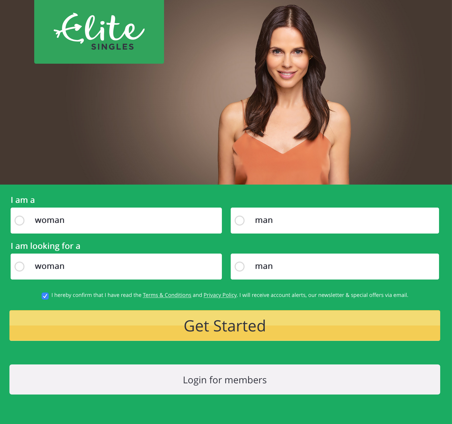
Disappointing, in exactly the same way Match was. However, this is even more aggressively coercive than Match: once you pick what you’re looking for, you’re auto-taken to sign up:
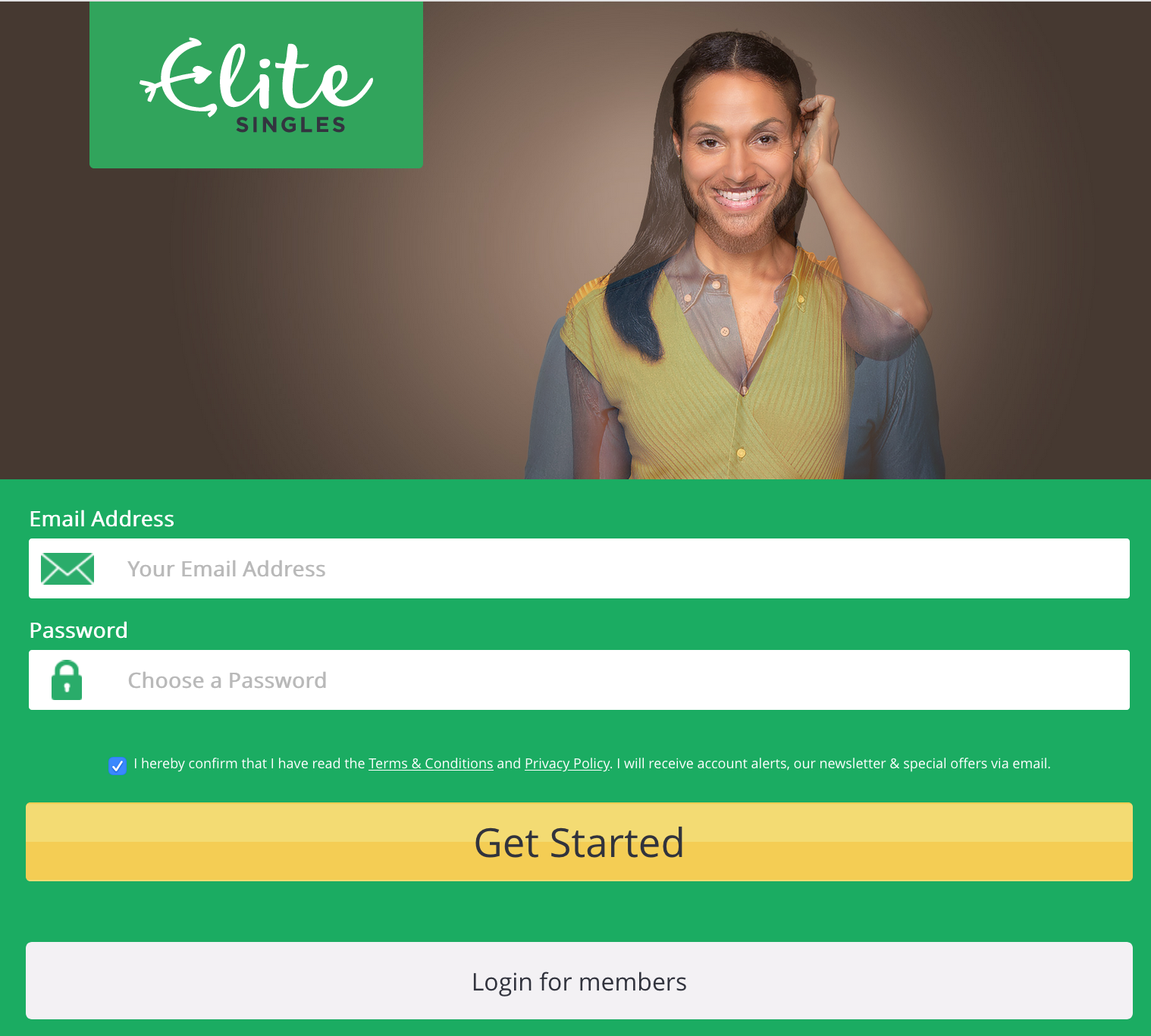
Please note the creepy results of fading between pictures. I didn’t even notice this until pasted the picture in here.
If you’re, for instance, bisexual, and wanted to click both check boxes, nope. You gotta go. EliteSingles, I know you want to get people through the process and make it quick and easy, but this is gross.
Do Match and Elite do usability testing with a diverse set of testers? At this point I’m willing to bet that Elite’s decided their target customers are heterosexuals, predominantly white heterosexuals, and maybe — maybe — they think about homosexual people occasionally. And if not, they seemingly made a conscious decision to keep same-sex couples off their home page. Why would you do that? Do you think that there are enough heterosexual customers who’ll leave if they see a gay couple? Why?
Anyway. I’m writing a blog, I persist.
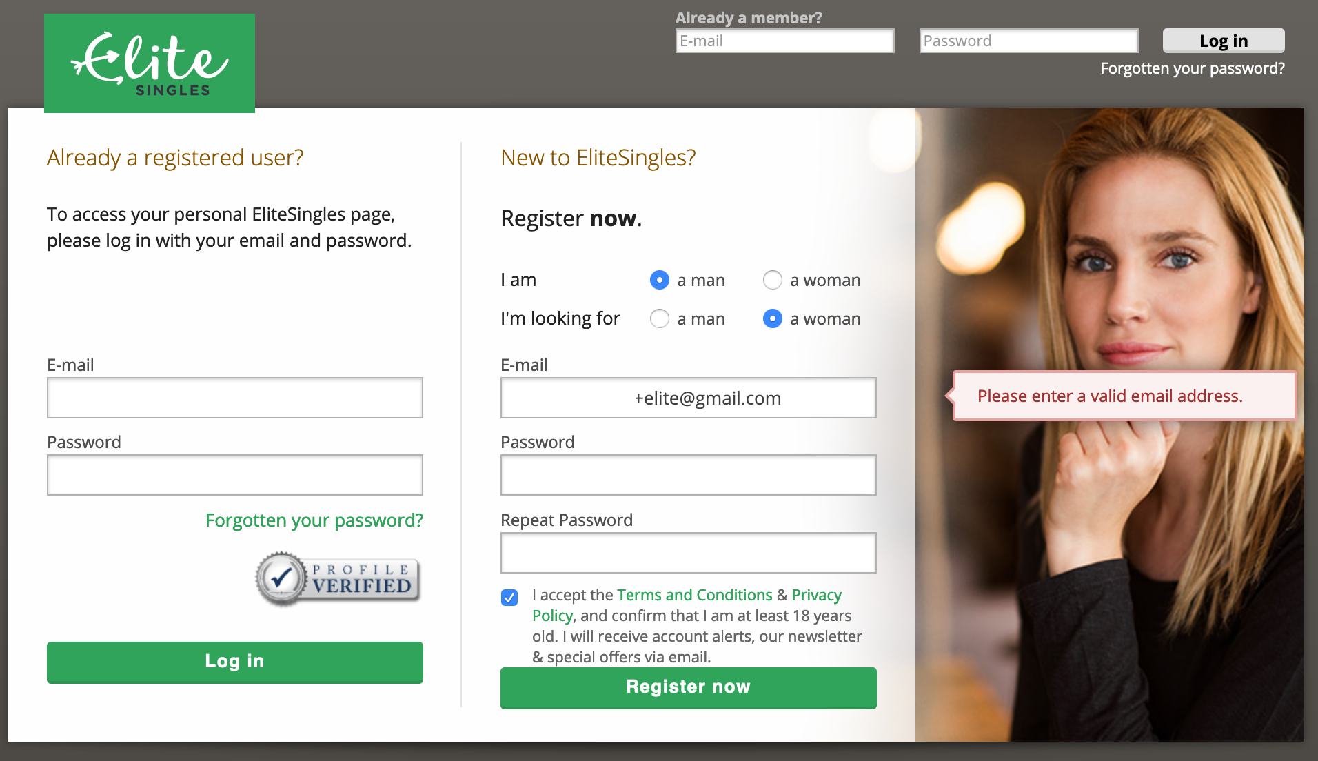
It’s weird they ask you for email and password and then take you to this page, which is asking you the same things, including getting you to agree to the T&C. Why would you duplicate this step, especially knowing this kind of early gate is going to have a huge impact on conversion?
Despite having said you’re new — or at least, having passed up the chance to say you’re a returning customer and login — the “already a registered user?†is the most prominent box, the first thing people are going to see on this page. Do that many people enter their email and password on the first page as if they’re new? Regardless, this feels like something you could clarify in one step, rather than have two confusing duplicative pages.
There is also at the top a duplicate “email/password†path to login. This page feels like it might be a vestigial page that’s still in the path after a redesign because it’s load-bearing.
A big point about a small thing: note it would not let me use a + in my email address, which is a cool way to do cool things with your gmail address. It claims it is not valid. It is! It’s in the spec for email addresses! Sure, many sites don’t let you use some special characters, but they are lying that it is not valid. This is not a great way to go for a site you’re going to trust with incredibly intimate information.
I know, it’s an email validation thing, and maybe they have problems with people using valid special characters and it bouncing (I would wager this justification is not backed by good data).Â
How you act in the small things is how you act in the big things. I don’t like this.Â
Sigh, let’s go.
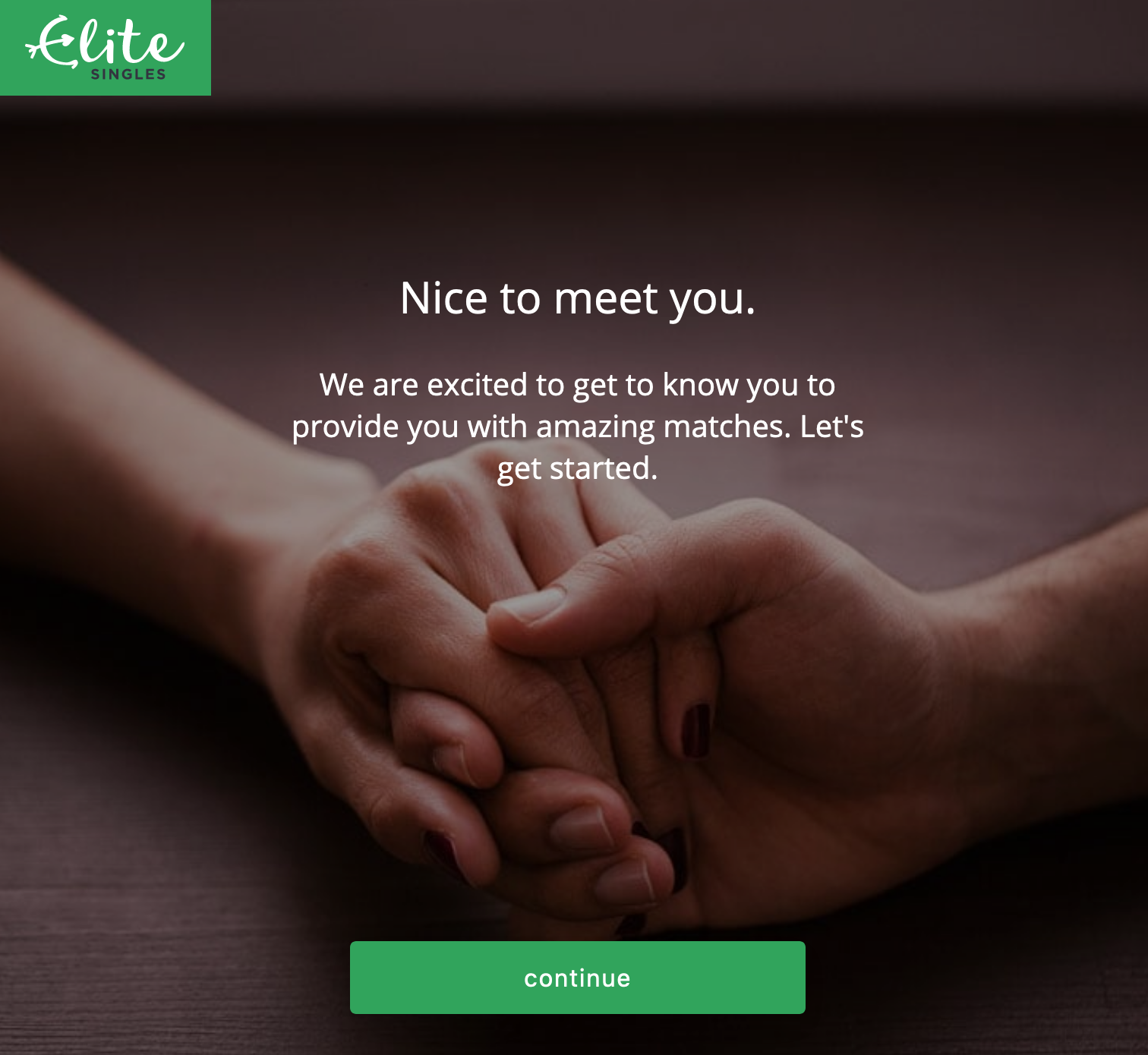
Please note that one hand has painted nails and a smooth, seemingly hairless arm, and the other — it’s another white heterosexual couple is my point. Do you see this if you’ve said you’re homosexual? Place your bets…
It does. Of course it does.
Anyway, I too am excited to be provided with exciting matches.
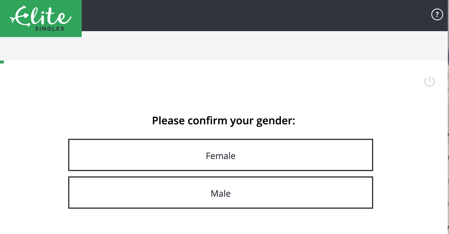
What a pointless, offensive screen. One, you’ve already identified yourself as “man†or “woman†in the first screen — a question asked without making it about gender.
But here you go! You have to confirm your gender. Your gender has to be one of those two things. What a crock of shit. I can’t even imagine what it feels like to have dealt with gender identity discrimination and come across a gate like this… when you’re trying to meet people.
Why would you do this?
Anyway, I was mad enough about this that I emailed their support address and said
Hi!
The first question in the registration process is to pick a “gender” of
male/female. It’s 2019, gender’s a spectrum and biological sex is kinda
irrelevant. Why are you asking this as if it’s a binary? What happens
to people who don’t identify with either binary?
A little glib, maybe. Anyway, they got back to me:
Dear Derek,
Thank you for your message.
IÂ appreciate what you are saying and that opinions differ around this
subject currently. We currently don’t have any plans to change this part
of the process however I will be sure to pass your comments along to
the relevant department.Let me know if you have any further questions.
Please note that the question is not answered. But it’s the “opinions vary†that infuriates me. To have this page, to have this page like this, is a clear choice on which opinion you’re lining up with, and it’s the most regressive and hurtful one. This is such a crazy, dismissive, bullshit response. I want nothing to do with them. I abandoned the first time I hit that screen, and now… I’m writing this. Afterwards I’ll go into one of those sci-fi decontamination chambers where a burst of radiation destroys the outer layer of my skin entirely, hopefully before this seeps in.
How bad does this get? It gets pretty bad doesn’t it? Some highlights!
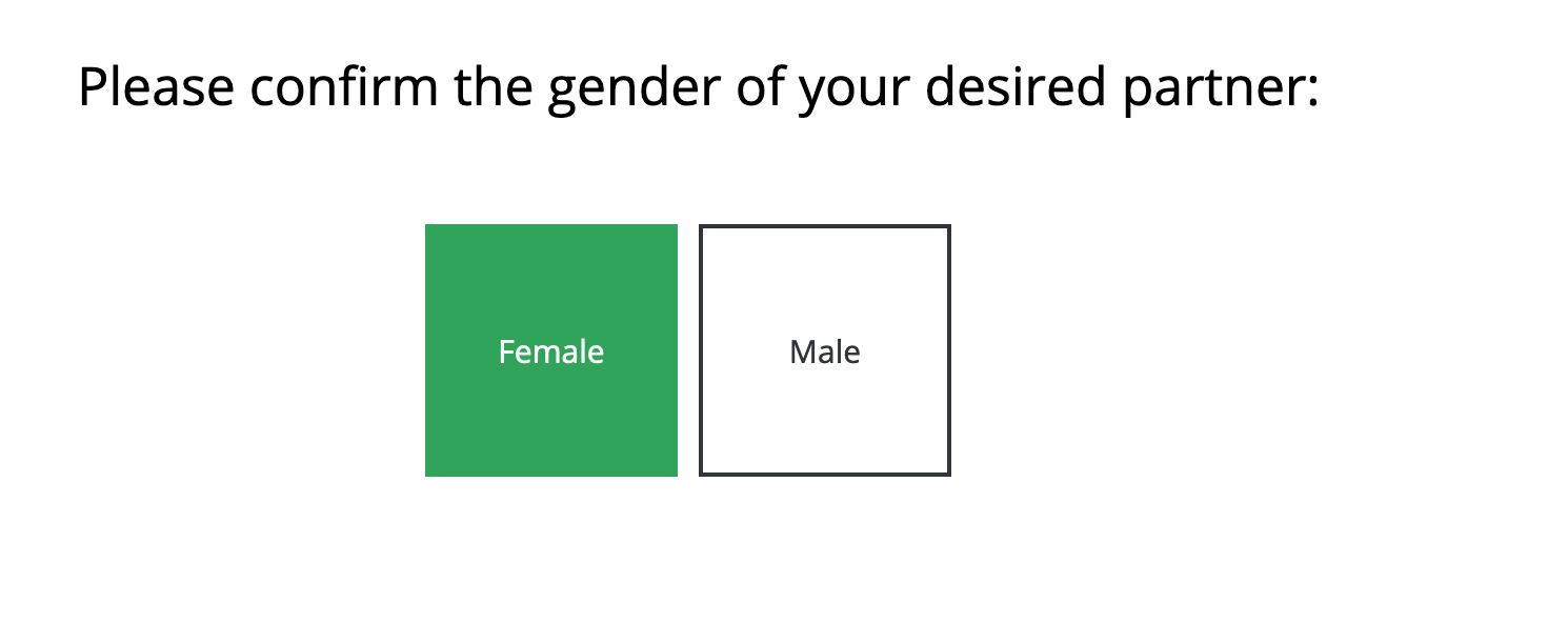
I’m supposed to confirm their gender? Look, you’re the ones asking intrusive questions so I don’t have to.Â
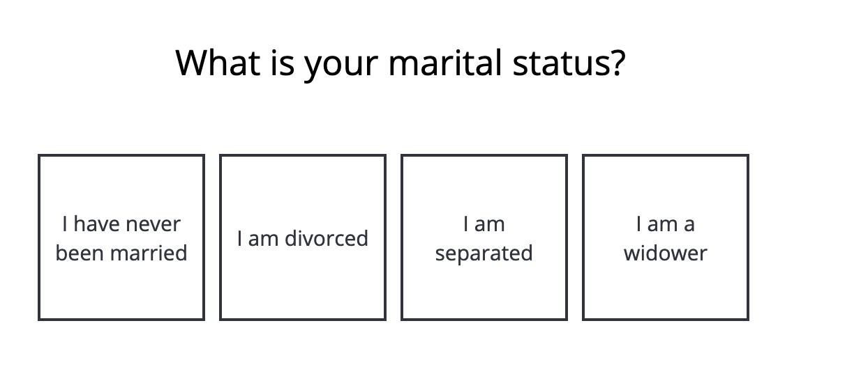
Why, EliteSingles. Why. Are you doing this because Match does it?
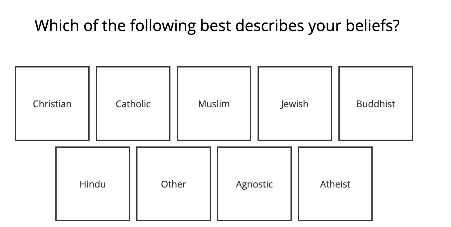
Beliefs. Okay, that’s better than asking what your religion is and forcing everything under that label. I’m at least grateful —

WHY WOULD YOU DO THAT.
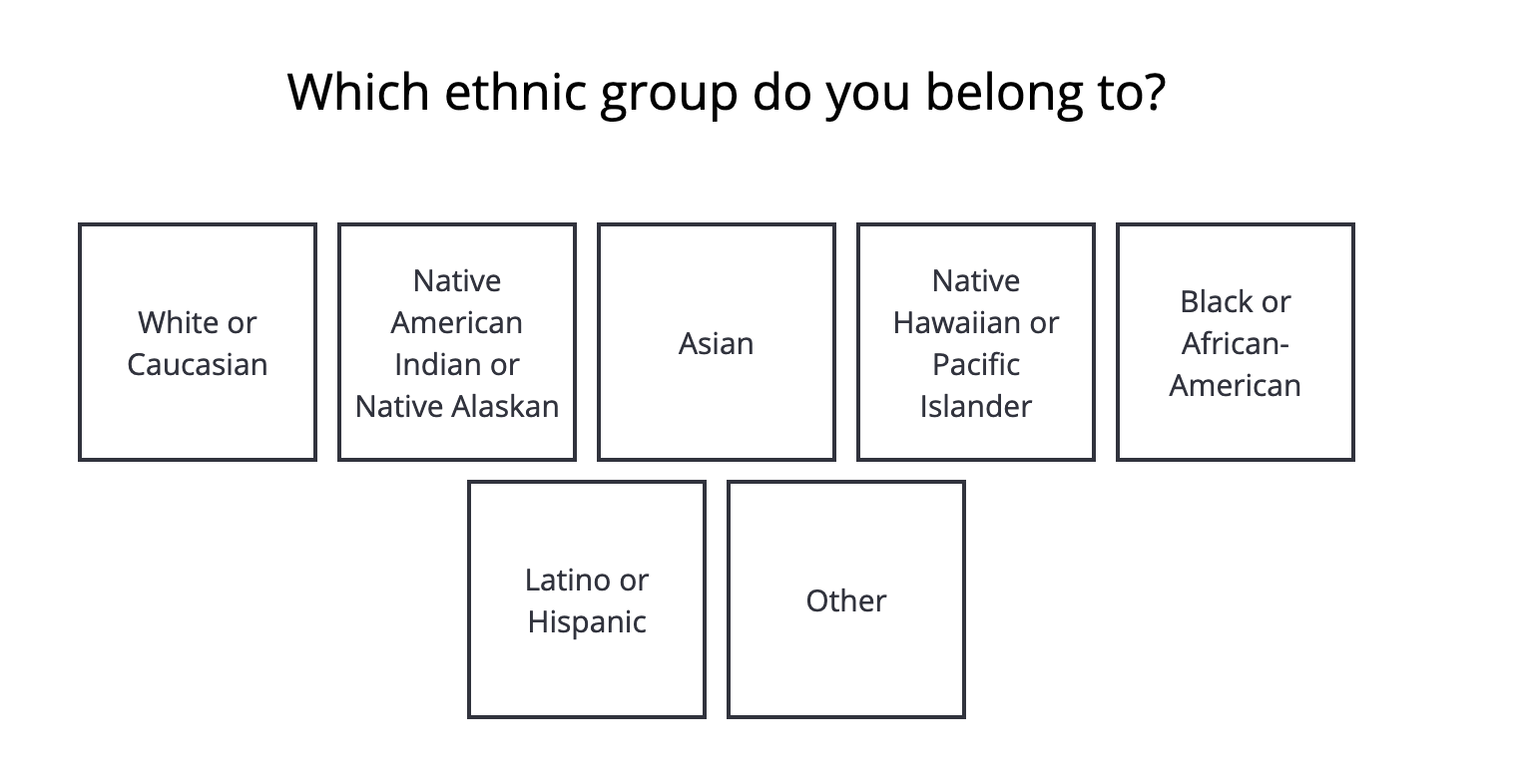
Is this the touch screen kiosk at a checkpoint in a fevered sequel to the Turner Diaries? What… whyyyyy… ugh.
Can you pick more than one? Guess. No, go ahead. You’ll be surprised at this answer.
I lied, you’re not going to be surprised: one. You’re auto-advanced to the next screen after you pick one. This is yet another point I wanted to throw in the towel.
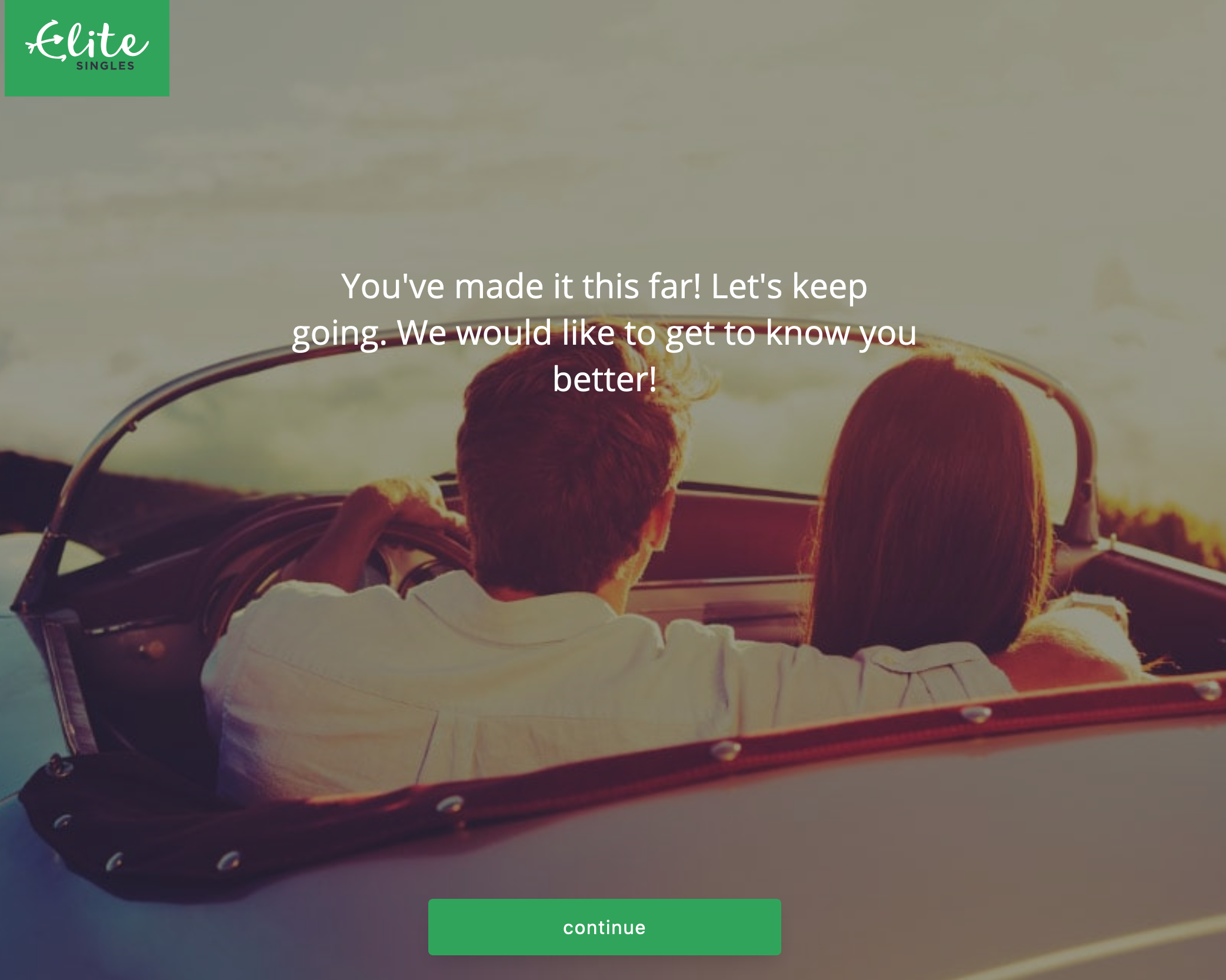
After answering enough questions to get to about the one-third mark on the progress meter, it’s time for an intermission slide!
Reader…
Is it a picture of what is almost certainly a heterosexual couple?
What do you think?
What are the odds that it is not? What would I have to offer you if you were going to pay me $1 if it was not a heterosexual couple?
$10?
$100?
$1,000?
You’re still not taking $1,000.
Because of course it’s a heterosexual couple. Of course it is. Are they white? Your call, but… yes? It seems like a safe assumption.
Many questions later…
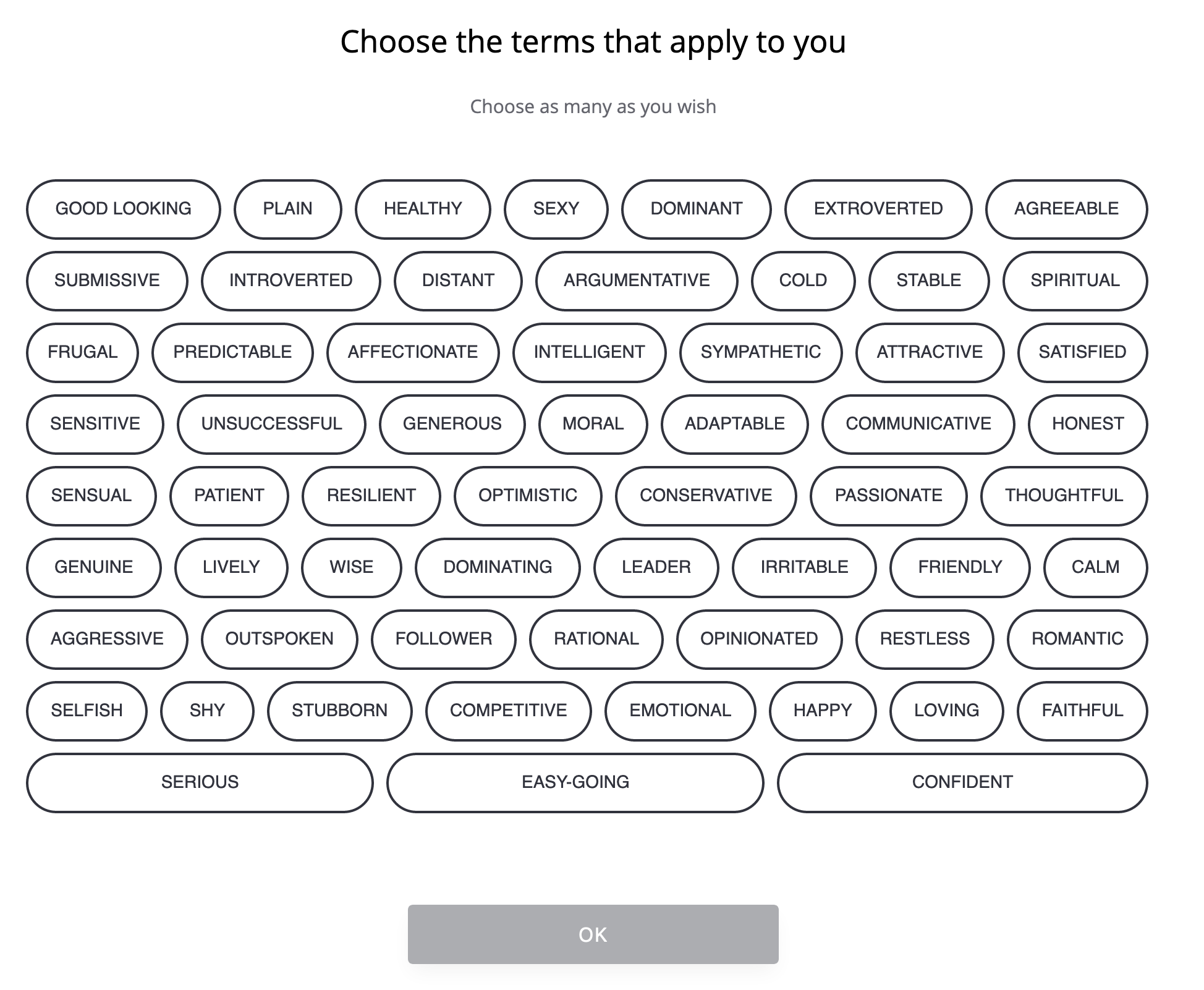
Why not one line that says “Choose as many terms as apply to you†or another single sentence, rather than two?
Then… aren’t many of these terms everyone wants to ascribe to themselves? And who is going to check “unsuccessful†besides people who meant to click other bubbles and missed?
“Yeah, I’m good looking and attractive, but I also want to click honest, soooo distant, cold, argumentative, both dominant and dominating, irritable…”
You’re free to click as many as you want, but then they make you focus:
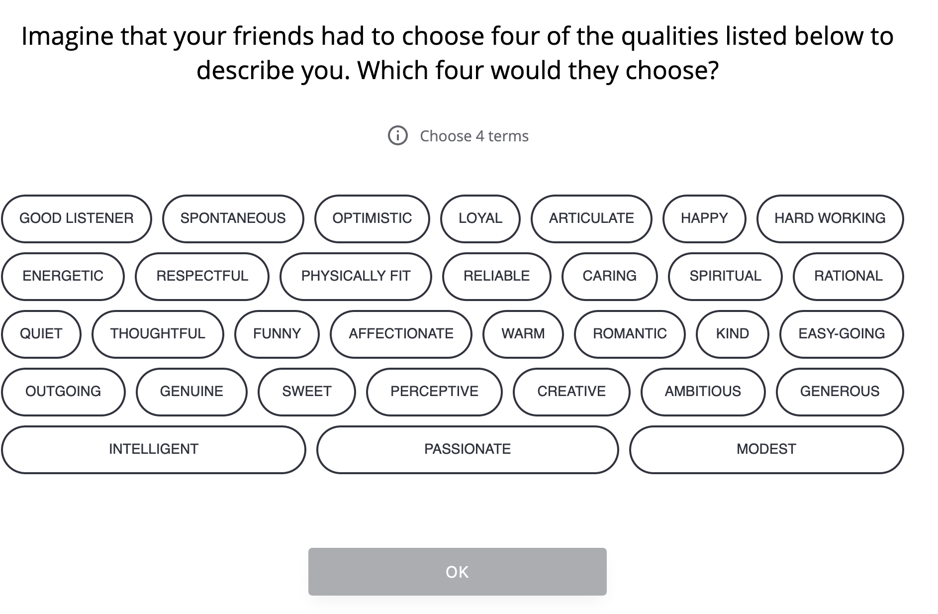
This is an interesting approach and I’d love to see the data of what people initially pick to what they narrow to. I’d also be interested in how they’re using each of those: are they put to different purposes? Are (as I’d suspect) the second set used strongly in weighing potential matches while the first is not?
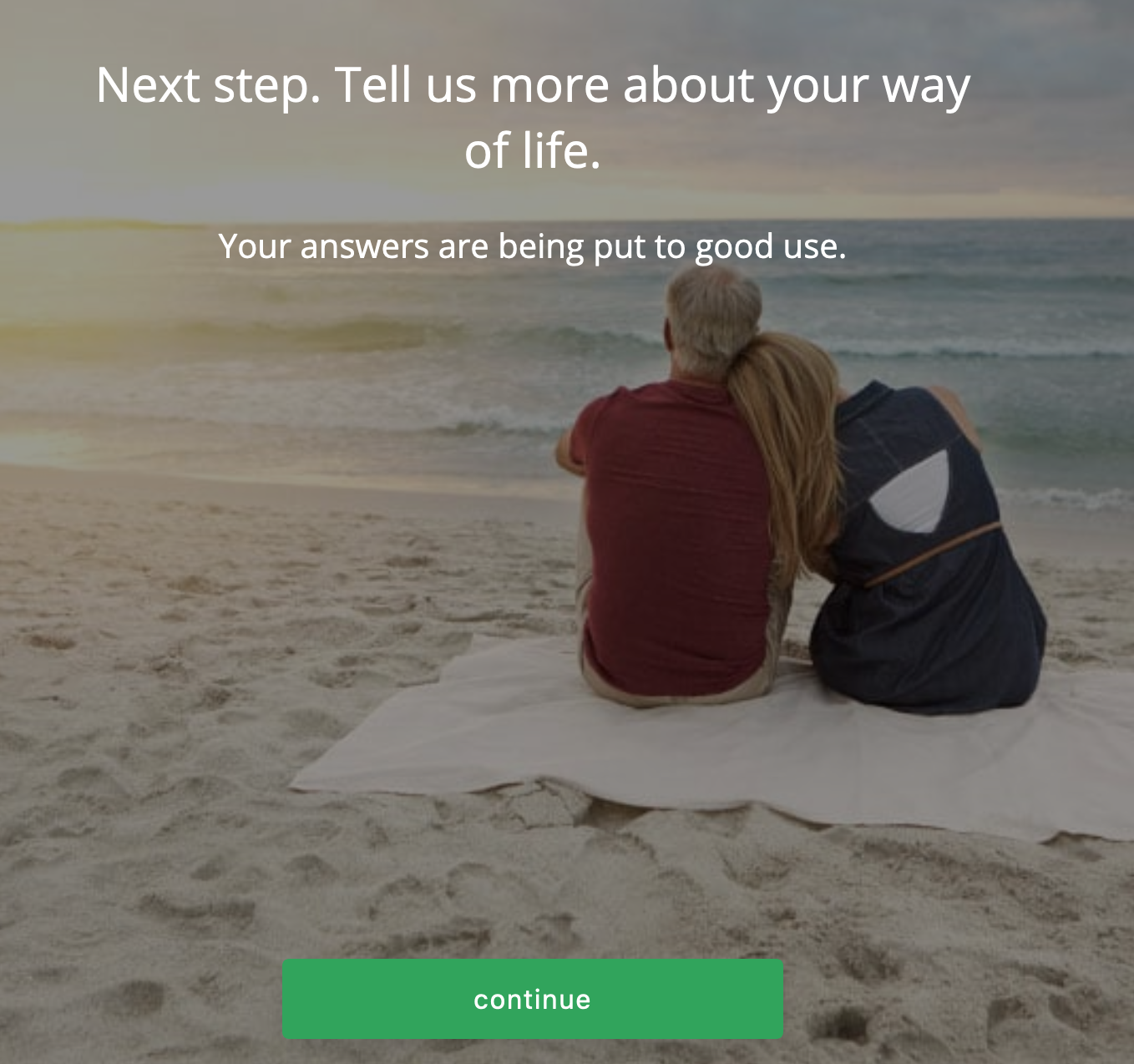
Hey there’s another intermission!
Quick, is it a white heterosexual couple looking towards the future?
Don’t roll your eyes at me.Â
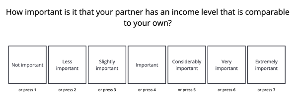
There’s a ton of multiple choice questions in the process like this:
Interspersed with free text answers like:
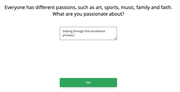
Â
It’s unfortunate that these are so late. At this point you’ve been in the process for at least 30 minutes from the start. Who’s going to answer these well?
Their distance question is interesting to me:
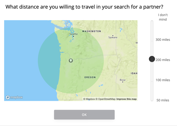
Even if you want 200, you have to move the slider before ‘OK’ is usable, which I don’t understand.
But my point: defaulting to 200 allows them to mitigate a huge problem for non-Tinder sites. If you join a site like this, especially if you’re paying — and do note that at no point in this process has there been a glimpse of “there are actually people on the other side, see?†as Match.com did — you need to come out of the gate with something. So it’s framed as “are you willing to travel in your search for a partner†and it’s anchored cleverly: the top option is infinite! Are you a true romantic or do you have blinders on in your search?
I’m a little surprised the language isn’t stronger: “How far would you travel to meet your partner?†Any direct suggestion that not traveling farther might mean you’re not going to meet your match. And the “I don’t mind†for infinite distance seems tepid. “I’ll travel anywhere†or “We’ll figure it out†would be stronger language.
I will now reveal what happens when I’m tired, have spent 45 minutes on this process, and come across some baffling UX. It’s…. It’s not flattering.
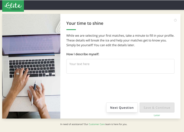
First, they make it seem like you’re just doing this for funsies, while they’re lining up matches for you. But there’s no progress meter, no updates that they’ve got 1, 20, -4 matches in the queue. So why hang around indefinitely? And why take these seriously, if they’re already able to go find your matches?
I don’t have answers.
Second, let’s talk about how confusing this is.Â
There is a “Next Question†button. What do you think “Next Question†does? You type your answer, you hit next question, right?
Because there’s a button there that says “Save & Continue†that, presumably, saves how far you’ve gotten and you come back to it. That’s a reasonable assumption. It’s even labeled “Later.”
No. “Later†is a link, it bails you out entirely. It is a third, different action, which does something larger than those buttons, but is in smaller text.Â
If you enter an answer and then hit “Next Question†you are not given a “Discard answer and go to the next question?†warning or anything. You just get the next question, as if everything’s fine.Â
Why would you do this? You have three actions:
- move to the next question, discarding any answer the person’s entered
-
move to the next question, saving the entered answer
-
quit answering questions entirely
I’m baffled why you’d choose the UI they did, where the first button… argghhh.
As you can probably guess by now, I spent minutes answering questions and hitting “Next Question†until —Â
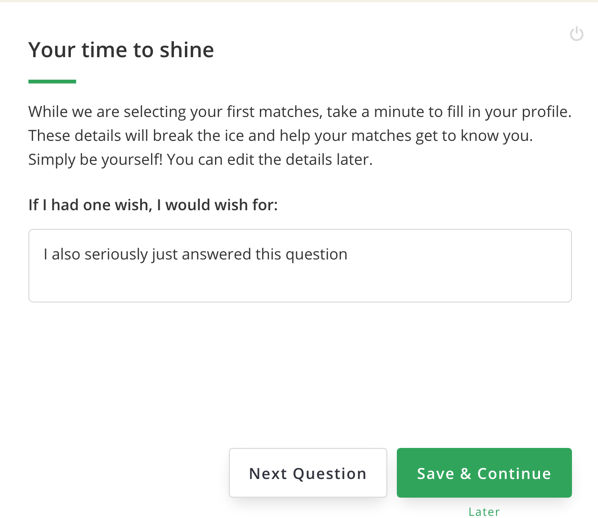
I bailed on questions, and as a reward received this screen!
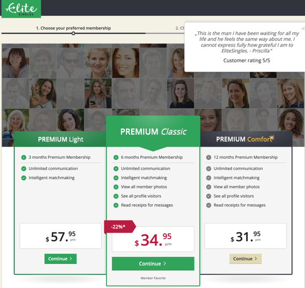
I found this page incomprehensible.
“Member Favorite†like it’s a mobile game asking you to purchase qDollaz or something.
First, the tiers make no sense to me (and I will not be typing them in all-caps). Premium can’t be Light. Premium Classic, sure, and Premium Comfort. But the distinction is Light to Classic? Light to Comfort? Light has fewer features, but there’s seemingly no difference other than length of contract between the other two. But they have different color schemes! Classic is in italics!
Comfort has that gold sparkle on the name! And is otherwise shown in a drab color scheme that isn’t like what we see elsewhere in the site. Why is that one not done in the EliteSingles green? Why is even the “Continue†in a different color — one that hasn’t meant ‘go’ in the process so far? ! Whyyyyy?
Classic is also the only one with a discount! It gets a red badge! And a red price!
Second, this pricing is just wild. As far as I could decipher:
- Light has fewer features, but you’re only on the hook for 3 months, so it’s $174
-
Classic has all the features, for six months, so $210
-
Comfort runs for twice that at a slightly lower price, so $384
Â
I don’t get why it’s framed this way either. The worst quality product is presented as if it’s the most expensive. Maybe they’re trying to anchor people with that higher price, but that’s confusing as hell. “Wait this one is terrible… and expensive?†And then the one they’re pushing, which has the “just right†middle price and middle term, shares the color scheme with the crappy one, features with the Comfort, is discounted, but is still more expensive…
It’s like they wanted the reaction to be “Ugh, what? Oh hey, Goldilocks option before it gets all drab over there, I can’t be seen buying something where the buy button isn’t even enabled…”
This isn’t how anchoring works, though. If you do anchoring well, it’s more like…
- Luxury! Our platinum toothpicks… $50,000 for a set of two. Monograms available, inquire.
-
Good! These reusable toothpicks are made of stylish graphite! $10.
-
Enh! Toothpicks, like you get in the store. Box you’ll spill on the floor before you get through it, $2
-
Awful! Made of the worst, most splinter-prone Ash we could source, you’ll hate using this only a little less than your dentist hates you for using them! Crate of millions, $1
Â
Right? You can experiment with pricing, number of options, and features, but this is what you want. You want the customer to say “Can I afford the better version I want?”
Here, the worst version as presented is also presented asÂ
I can only think that they’re doing this because they want everyone to pick that option. If that’s the case, why present options? Or, why not just present one product, one price? Or perhaps just show different term/rate combinations as the way to offer choice?
I don’t get this screen.
I also didn’t get EliteSingles Premium Classic, or any of their options.
…
Â
I feel like I need to offer some kind of conclusion, some neat summary of the experience and recommendations from a Product Manager-y perspective.
I can’t. I’m going through this both as someone who has lived in this world, and who would so much like to find one of these services that is not terrible. When I go through something like EliteSingles’ onboarding, I’m just sad. Why not pay attention to things like diversity of appearances? Or whether you’re enforcing beliefs that — even if you truly, fervently believe that there are only two genders, why be a jerk about it to people who think they’re not? What’s the point? Also, gender’s not binary, it’s hugely complicated, I’ll acknowledge we as a society haven’t figured out how to work with that complexity. We can try, though. We can at least do that.
I also always feel like when you notice something like that — and I’m a privileged heterosexual cis white man, I am not nearly as good at seeing things like this as I could be, but I’m trying, and if I see it — it’s a huge red flag that the people and/or the company as a whole are lacking in empathy.
Dating is incredibly difficult and stressful. You don’t want to go into that with someone you don’t trust, and don’t trust to be honest and understanding.
I don’t, anyway.